- General Blogging
Heat Maps: Why We Love ‘Em and How We Use ‘Em
•
 With the help of a full service ad manager, knowing exactly where ads will earn well and perform the best is pretty simple. We’ve already done all of the testing and research for you.
Making decisions about the other elements on your site, though? Sometimes it’s just not that simple.
Most of the time our decisions as the creators of content and masters of our own domains are a little bit arbitrary. We know how WE use our sites, but it can be tricky to know just exactly how our readers use the content we put so much time into creating. Being able to use actual data to help understand reader behavior and how to make my site more useful overall is why I love heat maps.
With the help of a full service ad manager, knowing exactly where ads will earn well and perform the best is pretty simple. We’ve already done all of the testing and research for you.
Making decisions about the other elements on your site, though? Sometimes it’s just not that simple.
Most of the time our decisions as the creators of content and masters of our own domains are a little bit arbitrary. We know how WE use our sites, but it can be tricky to know just exactly how our readers use the content we put so much time into creating. Being able to use actual data to help understand reader behavior and how to make my site more useful overall is why I love heat maps.
What is a Heat Map?
“Website and product heatmaps visualize the most popular (hot) and unpopular (cold) elements of your site’s webpage content using colors on a scale from red to blue. By aggregating user behavior, heatmaps facilitate data analysis—combining quantitative and qualitative data—and give a snapshot understanding of how your target audience interacts with an individual website or product page—what they click on, scroll through, or ignore—which helps you identify trends and optimize your product and site to increase user engagement and sales.” — Heat Maps FAQ from Hotjar. You can use heat maps in all sorts of ways, but no matter the detail you are trying to analyze, heat maps will give you a real world visual representation of where readers are spending time and what they are clicking on while they are engaging with your site.
How Heat Maps Can Help You Optimize
I’ll start with my favorite example: The Email Subscription Form. Email lists are unfailingly valuable, and we are all trying to capture those readers that might have just popped in for a quick visit, and turn them into long-term subscribers. Smart placement with email subscription forms is crucial for conversions. For as long as I can remember, I had an email subscription box in my sidebar. It seemed like a logical place to stick that, and every blog I have ever read has an email sign up in the sidebar so I figured ¯\_(ツ)_/¯. Seems like a good idea. I also embedded my email form into the bottom of each blog post for my mobile readers. “Cover all the bases!” That was my thinking. Then I decided to do a site speed audit, and in the report I got back my email opt-in was slowing things WAYYYYYY down on every page of my site because it was running not once, but twice. So I had a dilemma. WHICH ONE DO I DELETE!?!!? I installed a heat map to find the answer. Hot Jar is my personal preference because it’s free up to a certain number of page views and I really like the reporting. It’s easy to understand. But there are tons of options out there to choose from.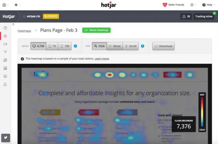
What I Learned
I set up a basic free heat map measuring just 1,000 visits to one of my most popular posts, and what I learned was that NO ONE WAS EVER CLICKING ON MY SIDEBAR EMAIL OPT-IN. I ran another 1,000 to test on another popular post, and then another. And still, no one was ever, ever using that email subscription form. I removed my email subscription opt-in from my sidebar and my adoption rate hasn’t fluctuated at all. Using a heat map on my site really helped me to understand that making that decision wasn’t detrimental to the growth of my email list. Instead I learned how my readers are ACTUALLY using my website!
How You Can Use Heat Maps to Optimize
Are you trying to figure out which of your carefully curated widgets to remove from your sidebar? Use a heat map. Do you want to know which links your readers click on? Heat map. Are those in-post Amazon links working for you? Heat map. Do people know you have content past your giant email opt-in? You know the answer! HEAT MAP. There are many ways you can tweak and tailor and make your site more user friendly, and heat maps are so helpful in providing data and getting you pointed in the right direction. Pin this post!
About the author
Share this page