- Go for Teal
Increase Font Size, and Increase SEO & RPM Along With It
•
Post updated August 2021
One of the simplest, fastest, and most effective tweaks you can make to simultaneously improve your website’s user experience, SEO and RPM may surprise you:
Increase your font size.
We say it’s quick because it should require one easy change to your theme’s settings page, or a few adjustments to your stylesheet, to make this site-wide improvement.
Much of the advice we normally give publishers is on a per-post or a per-page basis which could require a lot of work on a lot of content over time.
This site-wide tweak is quick and easy — relatively speaking. We can’t just tell you what settings to change as font size is a little more technical than one-size-fits-all.
The internet is very different than the world of print or word processors in every respect, and fonts are no different. It’s important to define font size in web-specific terms.
Font size, on the internet and everywhere else, still involves measuring the height of letters in your text, but it can be measured in multiple units on the web.
The five most common units of measurement you’ll see are:
- point (pt)
- pixels (px)
- em
- rem
- percentages
You’re likely familiar with the first two on this list, especially points. If your theme uses these, providing you with a size recommendation is a lot easier.
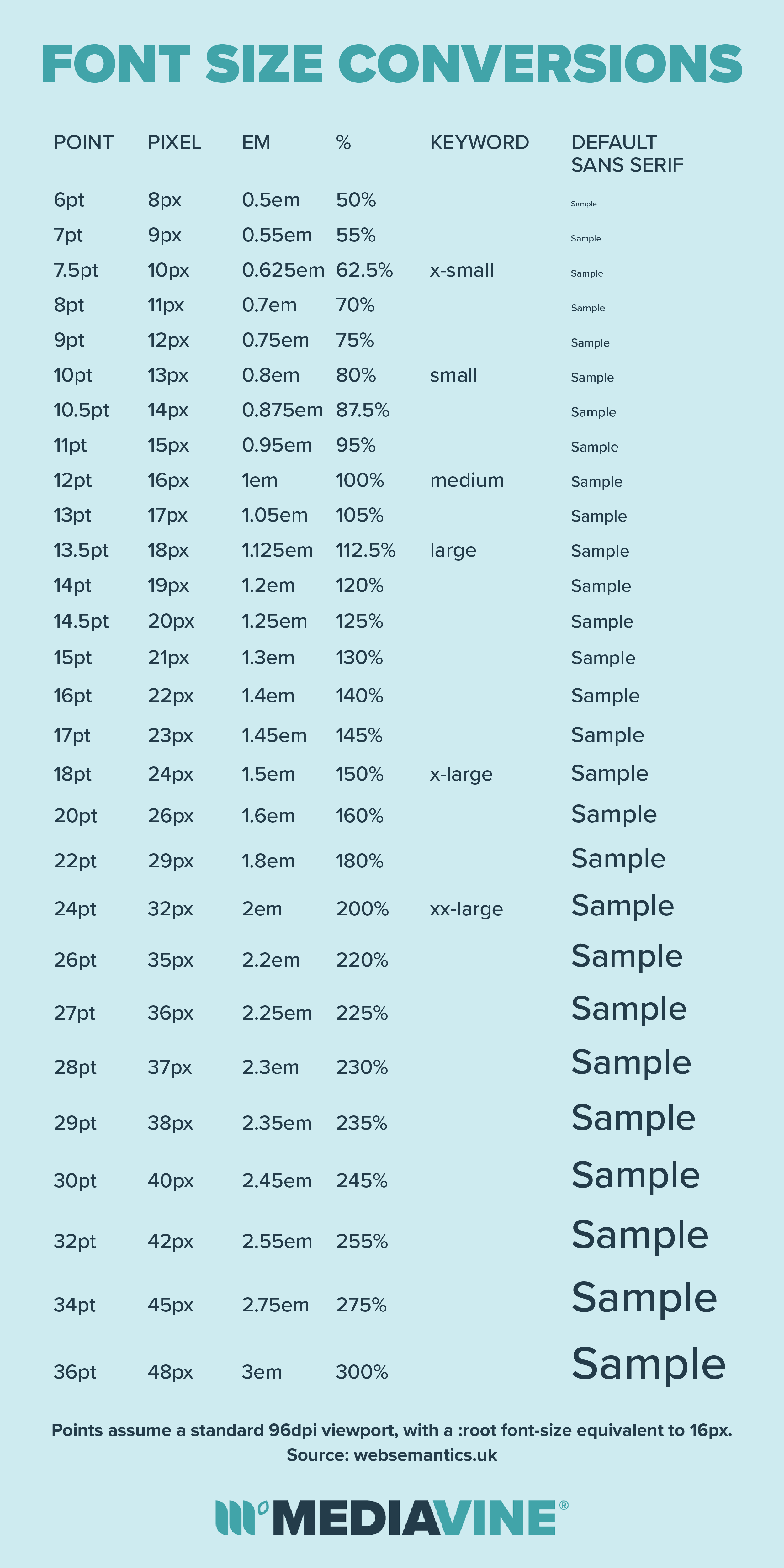
But first, a caveat: Points do NOT equal pixels.
Points-to-pixels conversions will vary based upon the DPI (dots per inch) or the resolution of the device(s) your audience is using to read your content.
A general rule of thumb is that 12 pt will equal 16 px on most devices, but not all.
Now, on to the items you’re probably not familiar with on the above list: rem, em, and percentages. These three are all going to be “relative” font sizes.
While these are more advanced, they’re generally considered the preferred method in responsive web design, so there’s a chance your theme or design uses them.
These are all relative to the base font, usually 12pt or 16px on most devices; if you set a 1em, 1rem or 100%, then, in theory, that’s the same as picking 12pt or 16px for most devices.
This allows you easily define headers, lists and other elements relative to the body of your text. For example, you could set your headers to be 150% or 1.5em, making them 50% bigger.
If you simply want to increase the size of your entire website, you can adjust the font size on the body or root, and it will adjust everything else up.
You can use the following conversion chart as a rough estimate, but remember that devices, user settings, fonts, themes and parts of your stylesheet can impact all of these.
All of that said, what font sizes are best for boosting SEO and RPM?
Increasing Font Size for SEO (and Readers, too)
Google uses a mobile-first index, meaning that when indexing your site to determine search engine rankings, they’re using the mobile version of your content.
The reason for this is simple: 80% of your readers are likely using mobile devices, so you should be prioritizing this as well. SEO, in this case, is entirely driven by user experience.
When designing your site and considering a font size, think of your most common reader. This is someone on a mobile phone, and they likely don’t have 20/20 vision.
If your font size is too small (and on mobile devices, it probably is), the first thing you’re doing is requiring your users do is pinch and zoom to read the content.
Having to do that throughout a site — especially one you read regularly or want to browse multiple pages of — makes for a terrible user experience.
That’s why Google’s Lighthouse tool measures font size, one major component of determining the mobile friendliness of your site, when calculating your SEO score.
The Lighthouse tool recently changed its own recommendations slightly, but it established 16 px as a base font of a site. That means the main text of your font should be set to 16px minimum.
In fact, that’s where Google’s Material Design style guide sets the base font size in its typography as well. So for SEO, you need a minimum of a 16px font to make sure your site is considered mobile friendly, which is crucial in the mobile-first index.
Increasing Font Size and Its Impact on RPM
Okay, so Google is happy with a 16px. Are we done?
Not quite.
Like most of our recommendations for SEO and user experience, adjusting font size can help your monetization. Our ad placement rules follow the Coalition for Better Ads standards, and like SEO guidelines, follows where user experience takes us.
We’re not going to insert ads unless your content justifies it. Larger font sizes don’t automatically mean larger content.
Plus, ads pay based on viewability and engagement. If you have a larger font size, and more users engaging with your content as a result, they’re also going to be more engaged with ads.
So what’s the ideal font size for monetization purposes?
Again, your main body size should be at a minimum 16px. If you’re using points, ems, percentages or any other units, make sure your body size is the equivalent (see conversion chart above).
We’d actually recommend going a little bit bigger than the minimum 16 px, just to be on the safe side, given differing devices: 18px should do the trick.
That may sound like a big number, but remember where your audience is reading and that it’s not an 18pt font; 18px is actually still pretty small on a mobile device.
Can you go even bigger than that?
Absolutely.
We’ve seen lots of sites perform extremely well with larger font sizes. Aimee of Shugary Sweets discussed this during the Facebook Live she did with us a few years ago.
What’s important is that a bigger font size looks good and provides the best user experience for your readers. All themes and fonts will look different at different sizes.
It never hurts to experiment with your font sizes and see which looks best — as long as you remember that 16px needs to be the absolute minimum.

Where do you make these changes?
If your theme has customization options, that’s your go-to, as it will mesh with your theme most seamlessly. Always check there in the appropriate settings page of your theme.
If it doesn’t, email your theme creator as they’re likely the best source of information and advice on how to increase your font size within that particular theme.
If you need to do it yourself, then you’ll need to edit your CSS. Under there, you can adjust font sizes with a little CSS that would adjust your H1 (header tags) and body font size like this:
body {
font-size : 18px;
}
h1 {
font-size : 24px;
}
However, please note again that there’s so much going into a theme.
There are line heights, character kerning and fonts all set throughout the stylesheet. Often times, it’s best to bring in your theme’s support or a tech person to help.
That’s a lot of words for something that we promise is usually pretty simple. So good luck, and go make your readers, Google and your wallet a lot happier!
August 2019 Update: This continues to be one of the most popular posts on the Mediavine blog, and for good reason. Tons of our publishers have seen an RPM increase after implementing this quick tweak to their font size. We added a couple new links to this post for your reference!
August 2021 Update: Our WordPress theme, Trellis, is now available for all WordPress users! Trellis makes font management super easy: Change your site’s font size with just one setting right in the admin — no CSS knowledge needed!
Don’t miss our entire Increasing RPM series for even more ways to work on your RPM, or our Content Upgrade Challenge that helps you audit your posts.
About the author
Share this page