- Advertising
Mediavine Display Adhesion: Introducing a New and Improved Ad Experience
•
What is the Display Adhesion?
Adhesions are the ads that stick to the bottom of the screen on Mediavine sites. Today, we’re referring specifically to the adhesion units that run traditional “display” or “banner ads.” First, to clarify the sometimes-confusing terminology:- On mobile sites, we mean the display adhesion running a 320×50, NOT our video adhesion.
- On desktop and tablet devices, we’re referring to the banner running the traditional 728×90 unit and similar ad sizes.

- According to official Interactive Advertising Bureau (IAB) specs, these are known as ad “mobile adhesion banners.” According to Google AdExchange, they’re “horizontal sticky ads.”
- At Mediavine, we use the term “adhesion” for desktop and mobile ads of this nature; both adhere to the bottom of the screen, so we feel it’s the clearest description.

What’s NEW in the Updated Display Adhesion?
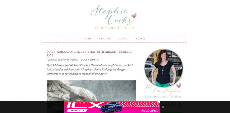
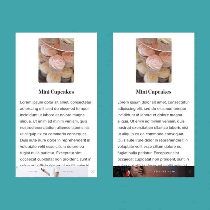
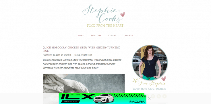
The biggest difference is a minimalistic, compact design. The new adhesions blend seamlessly and aesthetically into individual websites and will continue to respect your choice of a dark or light theme. Sadly, this means we’ve removed our signature Mediavine teal buttons. (I know, I’m more upset than anyone, but we think this is a great move overall.) The X no longer appears at the top right of the gradient banner; You’ll now find it moving inside the bottom gradient, right next to the display ad.
Why the Design Changes?
Mobile Accessibility
First and foremost, the new adhesions are designed for mobile accessibility. We follow Google Material Design’s best practices and now provide a 48×48 touch area for the close button, while ensuring that it maintains the minimum distance from the banner ad and any other object.No More Report Exclamation Mark
While we never like taking away any features, we’ve removed the exclamation mark, and with it, the ability to report adhesion ads. Ultimately, with this larger touchable area, plus the distance changes, there just wasn’t room left to include it without hurting user experience. According to our research, almost no one was reporting mobile adhesion ads to begin with. More than likely, this was due in part to limited space and lack of clarity on how to report those ads. We’re working on solutions for publishers to be able to report those ads, but for the end users, the exclamation mark ultimately wasn’t a viable solution at this time. We think the improved user experience provided by the larger close button is a net positive, and that should hopefully alleviate much of the concern.
Improved UX and Ad Performance
Making sure the adhesion is easily closable for users that wish to collapse it sounds counterintuitive for an ad management company, but balancing user experience and ads is always the goal. Crazily enough, that larger touch area has NOT led to a revenue decrease during testing. We’ve seen an increase in impressions, eCPM, and CTR (click through rate) of the advertisement, meaning users are preferring this new adhesion design and NOT closing it as often.Consistent Mediavine Design
Mediavine’s new design team is slowly rebranding our products to offer a more consistent design across all experiences. The revamped adhesion is part of that bigger, ongoing process.Sticky Video Player Changes
With the smaller adhesion and moving the clickable area, some pretty big changes to our sticky video player, as well as the video adhesion, will follow before long. We’re just going to save that as a teaser for now, but exciting things are coming!About the author
Share this page