- General Blogging
Six Ways To Make Your Website More Accessible
•

1. Check Your Font Sizes
It’s important to use fonts that are large enough for your readers to, well, read! This goes not just for your headers and paragraphs, but also for all the other little text elements around your site, such as your byline, post date, and breadcrumbs. Every font is slightly different, but as a general guide, 16px considered the minimum size for paragraph text. When in doubt, go larger, not smaller. Bonus: Larger font sizes can also improve your RPMs! Additionally, it’s important that users be able to “zoom” with their browser to increase the font size on their screen, without loss of content or functionality. (The WCAG guidelines require users to be able to zoom at least 200%.) Thankfully, most modern themes will work fine for this — but just to be sure, you can easily test this by visiting your site and zooming in and out on a web page to see how it looks.
2. Use Sufficient Contrast
Have you ever visited a website where all the text was dark gray on a light gray background, and you could barely read it? This is all the rage, since it looks very slick and is easy to read, if you’re a 22-year-old designer right out of grad school. But if there isn’t enough contrast, it can be very hard for us “mere mortals” to read, of course. Low contrast text doesn’t just affect older readers — imagine trying to read a blog post on your cell phone, outside and in bright sunlight. Having higher contrast helps in situations like these, too. The WCAG guidelines for paragraph text is that the text should have a minimum contrast ratio of 4.5 to 1. Large text, such as your post title, must have a contrast ratio of at least 3 to 1. What does that look like, in the real world? Here’s an example of insufficient contrast — this uses light gray (#999999) and white, for a ratio of 2.85 to 1:Speak the speech, I pray you, as I pronounced it to you, trippingly on the tongue. But if you mouth it, as many of your players do, I had as lief the town crier spoke my lines.
Here’s the same text, but with a medium gray (#767676) that just barely meets the contrast requirements (4.54 to 1):
And here’s an example of the same text — but with full black (#000000) instead of gray (21 to 1). See how much easier it is to read?Nor do not saw the air too much with your hand thus, but use all gently, for in the very torrent, tempest, and (as I may say) whirlwind of passion, you must acquire and beget a temperance that may give it smoothness.
You can easily test the contrast ratio of various combinations using WebAim’s Color Contrast Checker tool, and you can test your site using WebAim’s Website Accessibility Evaluation Tool.Oh, it offends me to the soul to hear a robustious periwig-pated fellow tear a passion to tatters, to very rags, to split the ears of the groundlings, who for the most part are capable of nothing but inexplicable dumb-shows and noise.

3. Don’t use color as the only means of conveying information
Did you know that one in eight men are color blind? The most common form of colorblindness is a reduced sensitivity to green light. This generally means that someone will have a hard time distinguishing between red and green. My father has this form of color blindness. When I was a kid, we had an alarm system for our house and the only way to tell if it was armed or disarmed was from a single LED light at the top of the panel. It would be either red or green — but my dad could never tell the difference, since there were no other clues he could use. They just looked exactly the same to him. (Yep, he set off the alarm quite often!) This illustrates why it’s important to use additional ways to convey information on the web. That’s not to say that you shouldn’t use color as an indicator (color is great!) — it’s just that color shouldn’t be the only indicator. For most of us bloggers, the most common place this will be an issue is with hyperlinks in your text. This is helpful not just for people who are colorblind, but it also helps improve legibility overall — making it clearer what text links to something else, thus improving the overall usability of your site. Take a look at this bit of text, with a teal hyperlink:Here’s another, with the same color and with the addition of an underline on the link:Be not too tame neither, but let your own discretion be your tutor. Suit the action to the word, the word to the action, with this special observance that you o’erstep not the modesty of nature.
See how much easier it is to spot the link when it has an underline? There are other ways you can apply this guideline — you don’t have to use underlines — but that’s the most common and most recognizable by users.For anything so overdone is from the purpose of playing, whose end, both at the first and now, was and is to hold, as ’twere, the mirror up to nature, to show virtue her own feature, scorn her own image, and the very age and body of the time his form and pressure.

4. Provide meaningful text alternatives to non-text content
What this generally means for us bloggers is: Use your Alt tags correctly! The “Alt” text field for images is for alternative text, and it’s been an accessibility feature since the very early days of the internet. Image alt text should describe the image in a concise phrase or sentence. If it includes your target keyword for that post, that’s fine, as long as that’s actually helping to describe the image. And, if you have multiple, similar images on a page, be sure to describe them in a way that makes them distinguishable. (Learn how many images you should have in a post.)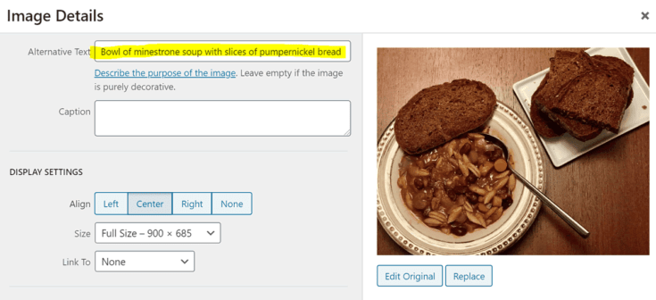 It’s not the place to put a Pinterest description, nor to drop in lots of keywords in the hopes of getting good Google rankings. It’s there to provide a text-based description of an image, in case the reader cannot see the image for some reason.
Yes, some readers may be visually impaired and using a screen reader to help them navigate your site. But others simply turn off images in their browsers (especially for those on slow connections, and/or with data plans that charge based on the bandwidth used).
I learned of someone who has a blind spouse, and they shared that their spouse got frustrated by alt tags that don’t tell him what is in the image specifically. He would rather hear details from his screen reader like “parsnip risotto in a blue bowl” and “wooden spoon stirring risotto” — not “creamy parsnip risotto” on seven images on the page.
Pro-tip: In WordPress, if you go to the media library and add the alt text on an image from there, it will not apply to any existing posts. You’ll need to edit the post, click on the image, and add the alt text from there.
Another common place we find “non-text content” is videos. If you have videos on your site, be sure to enable closed captioning and/or add transcriptions below the video.
(If you don’t have any videos, check out this guide to getting started with video from Mediavine.)
It’s not the place to put a Pinterest description, nor to drop in lots of keywords in the hopes of getting good Google rankings. It’s there to provide a text-based description of an image, in case the reader cannot see the image for some reason.
Yes, some readers may be visually impaired and using a screen reader to help them navigate your site. But others simply turn off images in their browsers (especially for those on slow connections, and/or with data plans that charge based on the bandwidth used).
I learned of someone who has a blind spouse, and they shared that their spouse got frustrated by alt tags that don’t tell him what is in the image specifically. He would rather hear details from his screen reader like “parsnip risotto in a blue bowl” and “wooden spoon stirring risotto” — not “creamy parsnip risotto” on seven images on the page.
Pro-tip: In WordPress, if you go to the media library and add the alt text on an image from there, it will not apply to any existing posts. You’ll need to edit the post, click on the image, and add the alt text from there.
Another common place we find “non-text content” is videos. If you have videos on your site, be sure to enable closed captioning and/or add transcriptions below the video.
(If you don’t have any videos, check out this guide to getting started with video from Mediavine.)

5. Be intentional with link text
The clickable text of a hyperlink should be related to what it’s linking to. Said another way: A hyperlink should stand on its own, without any other context required, to help you know where it will take you. (Learn more about internal linking and external linking from Mediavine.) Imagine using a screen reader, and you’re on a Category Archive page of dessert recipes. If the clickable text for each recipe is “Read More…” you’ll go absolutely batty trying to figure out which link goes to which recipe! Examples of link text that you should not use on your site:- click here
- here
- more
- read more
- continue reading
- link to [domain.com/page]
- info
- more info

6. Use headings, subheadings, and lists correctly
Many of us are guilty of this when starting out (myself included…): We chose the various “Heading” sizes (H1, H2, H3, H4, H5, or H6) because of how they looked, not realizing that header tags actually mean something when it comes to the organization and structure of your content. Think of an outline in Microsoft Word. There are headers, subheaders and often sub-subheaders. There may also be bullet-pointed or numbered lists. Headings are important for accessibility, because it will help someone using a screen reader to navigate through your content — it will provide her an outline for a blog post, so she can “skim” the post in the same way someone might scroll quickly through a post with a mouse or a swipe. Similarly, it helps Google understand the structure of your content, so it can parse it better too. So, if you organize your content properly and use the correct tags (nested in the correct order), it’ll help your SEO rankings, too. (See Mediavine’s SEO Like A CEO series for more tips on linking strategy.) Here’s an example from Ramshackle Pantry — notice how Ben has structured the headers of the post, starting with H1 (the post title), and then moving to H2 (sections), and then H3 and H4 (sub-sections). It’s clear, logical and easy to follow.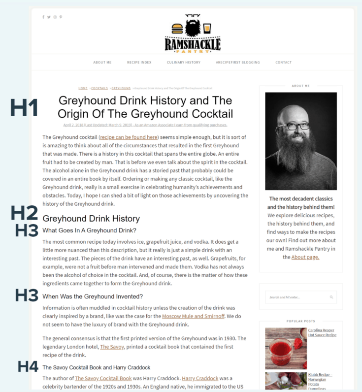 Also, check out how easy the links in the text are to spot, even in this screenshot, since they’re underlined!
OK, there you have it! Of course, these six recommendations don’t cover everything you’ll need to do to make your site accessible, so don’t miss my first post about accessibility that features a bunch of resources at the end. My hope is that you’ll use these two posts as a jumping off point to start improving your site and, ultimately, make it accessible for everyone.
Also, check out how easy the links in the text are to spot, even in this screenshot, since they’re underlined!
OK, there you have it! Of course, these six recommendations don’t cover everything you’ll need to do to make your site accessible, so don’t miss my first post about accessibility that features a bunch of resources at the end. My hope is that you’ll use these two posts as a jumping off point to start improving your site and, ultimately, make it accessible for everyone.
About Andrew
 Andrew Wilder has been building, fixing and maintaining websites since 1998.
He is the founder of NerdPress, an agency that provides WordPress maintenance and support services to hundreds of publishers — many of whom are MVPs!
Andrew Wilder has been building, fixing and maintaining websites since 1998.
He is the founder of NerdPress, an agency that provides WordPress maintenance and support services to hundreds of publishers — many of whom are MVPs!About the author
Share this page