- Pagespeed
How to Choose Fonts for Site Speed and Accessibility
•
Call me a typography nerd, but choosing brand fonts is always my favorite part of the design process.
Typography, the study of fonts and the way letters are designed has long been pivotal in providing readers with easy reading experiences.
(Okay, yes, I am a typography nerd.)
Best practices for choosing fonts for your website
I always recommend hiring a designer if you can afford one, even if just for your logo. If you’re in a situation where you have to choose a font, here are the most basic categories of fonts to choose from:
A quick crash course on typefaces
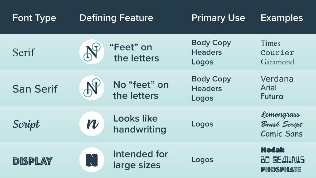
- Serif — Latin for the word “foot,” these fonts have “feet.” These are great for headlines or body text and logos, too. With higher screen quality these days, you don’t have to worry as much about these appearing pixelated when used at smaller sizes. Examples: Georgia, Times, Courier, Garamond.
- Sans Serif — These fonts tend to be more modern looking, as they don’t have the “feet” of serifs. (“Sans” means without!) They’re great for most uses online, from logos (hello, look at ours!) to headlines to body text. Examples: Arial, Tahoma, Verdana
- Script — Cursive, handwriting, whatever you want to call them. Examples: Brush Script, Comic Sans.
- Display — These fonts are everything else, pretty much. They’re the fun ones that don’t fit into the other categories, but they can be great for logos. Scripts can also fall into this category as they can sometimes be less readable. Use with caution but know that there are usually some fun ones in this area!
Choose a combination of fonts
When designing your website or brand, it’s a good idea to stick to only a few fonts. For example, at Mediavine, our brand consists of two fonts (a serif and a sans serif), which we use on everything we make. We will pull out other fonts for emphasis only on special occasions, such as a social post or an event logo.
Utilizing the different weights of your typeface is a good way to provide variety without overdoing it. Weights are the various thicknesses available within a typeface, such as thin, light, Roman, bold, extra bold, etc.
Keep accessibility top of mind
Back in the letterpress days, typesetters chose individual typefaces and letters and manually spaced them out to best suit the reader and the final output. Now, we can code these choices right into our websites, but many of the same best practices still abide.
Website accessibility is a big talking point these days, and for good reason: What’s the point of publishing all that wonderful content if a percentage of readers can’t see it?
For people with any kind of visual impairments, making sure all the text on your site is readable and legible is a huge part of being a good internet citizen. Here are a few tips:
- Body copy should have a line height and font size set to a comfortable level for all readers. (Bonus: This is great for RPM and above the fold SEO too!)
- Hyperlinks especially should at least be underlined and in a text color that is accessible, like blue. The idea is that a user should easily be able to tell when text provides a hyperlink. (Check out six ways to make your site more accessible for some examples!)
- Any font you are using should have contrast against the background. Fonts with thin lines and narrow details can be hard to read, so you might opt for a thicker weight. For example, Raleway is a font commonly used for body copy, but some of the thinner weights can be hard to read at smaller body copy sizes.
- When it comes to text colors, avoid using solid black (#000000). Solid black is the absence of light, so it stops light emitting from the screen and puts strain on the eyes as they adapt. Instead, opt for a dark gray such as #444444.
- Page titles and headings should be distinct from the body copy so they stand out for ease of reading.
- Though it may be tempting to adjust the fonts used in your site’s navigational features (like the navigation, sidebar and footer) to keep the focus on your content, keep in mind those areas should have fonts clear enough for a reader to find, read and click.
Pagespeed is paramount
Unfortunately for designers who could nerd out about fonts for hours, fonts aren’t always the best for pagespeed. And what do users, search engines and social media sites all care about?
Alas, fonts are an area of your brand that you may end up compromising for the sake of speed.
But you do have a few options when it comes to this compromise:
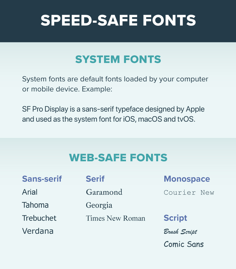
1. Stick to web-safe fonts
Web-safe fonts are the fastest option because the browser and website aren’t loading any extra files. This can be accomplished via some quick CSS or, if you’re using Trellis, in the Trellis settings.
This is the method we use on our owned-and-operated site, The Hollywood Gossip, which we mention in our case study on how The Hollywood Gossip passed Core Web Vitals.
2. Self-host fonts
With this approach, you can load the fonts into your theme directly, but there is a chance for some slowdown. Chrome and other browsers introduced font fallbacks, but when that fallback font is swapped with your Google Font, cumulative layout shift can occur.
No bueno.
3. Configure the CSS ‘font-display’ instruction
This method is a bit more technical, so I’m going to let our Product team take this one:
4. Install a third-party font
You can install a font through a service like Google Fonts or Adobe Fonts, but it also means your website can’t show any text until that font loads, so do so at your own risk of not passing Core Web Vitals.
This is definitely our least favorite option.
But what about my branding?
Believe me, it hurts my designer soul that some of my favorite fonts aren’t available as web-safe fonts. And it begs the question, why would Google provide web fonts and then ding us for using them?
But I have faith that the industry will catch up and give us more choices — eventually. In fact, there are new browser capabilities in development that will provide more options to balance performance and font selection.
My favorite part of being a designer is coming up with creative solutions to difficult problems, so I say there’s still a way you can maintain a branded look without compromising speed:
Incorporate the non-web-safe font of your choice into your logo or any images you have on your website while still using a web-safe font for text.
Use your favorite design tool to make branded images with the fonts of your choosing, all while keeping your site speed-focused with web-safe fonts.
And don’t fret — much to any designer’s chagrin, probably no one but you will notice that you make changes to your typefaces. Web-safe fonts are so ubiquitous, most people won’t think twice about seeing them.
About the author
Share this page