- SEO Like A CEO
Alt Text SEO: Building Better Rankings and More Accessible Experiences
•
What is alt text?
Alt text, which stands for alternative text, is the “alt” attribute on an HTML <img>, <picture> or other element. It’s “alternative” text because it’s displayed if the image cannot be shown otherwise, e.g. if the image had an error loading or if the reader is visually impaired and using a screen reader. Okay, but why is alt text so important, and what does it have to do with SEO? The Google SEO Starter guide dedicates an entire section to optimizing your images. Google’s top piece of advice, after telling you to use a lazy-loaded img or picture tag, is to use the alt attribute! That’s a pretty strong indicator that Google cares about alt text, and you should too.
What should I set as my alt text?
According to Google, you should write short, concise alt text that describes your image. A great example they use is that if your image is a link, write the alt text as if it were anchor text. However, just as we told you in our internal linking guide, Google caveats this by encouraging publishers to avoid image-based links whenever possible and sticking to text links. Google also specifically talks about using alt text for visually impaired readers, which is extremely important for making your website accessible, as we discussed above. In the Google Image best practices guide, the search engine we all look to for guidance, there’s a helpful example of how to write descriptive text for an image of a dog: Bad: Missing Alt Text or Keyword Stuffing Better: “puppy” Best: “Dalmatian puppy playing fetch” Makes sense, right? An equally simple yet helpful exercise is to put yourself in the shoes of a visually impaired reader. Describe the image to them, because that’s what a screen reader does: reads alt text to the reader. What if all of your images are the exact same picture, you ask? My answer would be that if this is the case, you may have a bigger problem on your hands and should rethink that strategy. Awhile back, I discussed how many images to include in a post on this very blog, and my advice was as many as you can — with an important disclaimer. You should only use photos that can each be described using unique alt text in your post. This is true for SEO, accessibility and user experience reasons. If all of your photos are of the same finished product and you can’t use different words to describe them, are they providing any value to the reader? The dual solution might be to use new and different images and, in the case of similar photos, find more creative and nuanced ways of describing them. Your readers and your rankings will approve.
Do I need my key phrase in my alt text?
If it’s naturally going to appear in your photo, then yes, 100%. Including the focus keyword of your post in one of the photos in your blog post is a great idea if you can, and extremely important if you’re using an image to link to your blog post. Again, as Google advises, you should think of alt text as your anchor text if an image is used as a link. However, as the example above says, please do not go overboard re: keyword density. Don’t just make your image alt text the same as your keywords. We use stock photos on the Mediavine blog, but we don’t just slap keywords onto them. That would be keyword stuffing. However, if we were to include an infographic of an “alt text decision tree” in this article, then you’d better believe our focus keyword of “alt text” is going to appear in that alt text. Bottom line, use the keyphrase but do so naturally and organically. And yes, spoiler alert: we’re about to discuss alt text decision trees.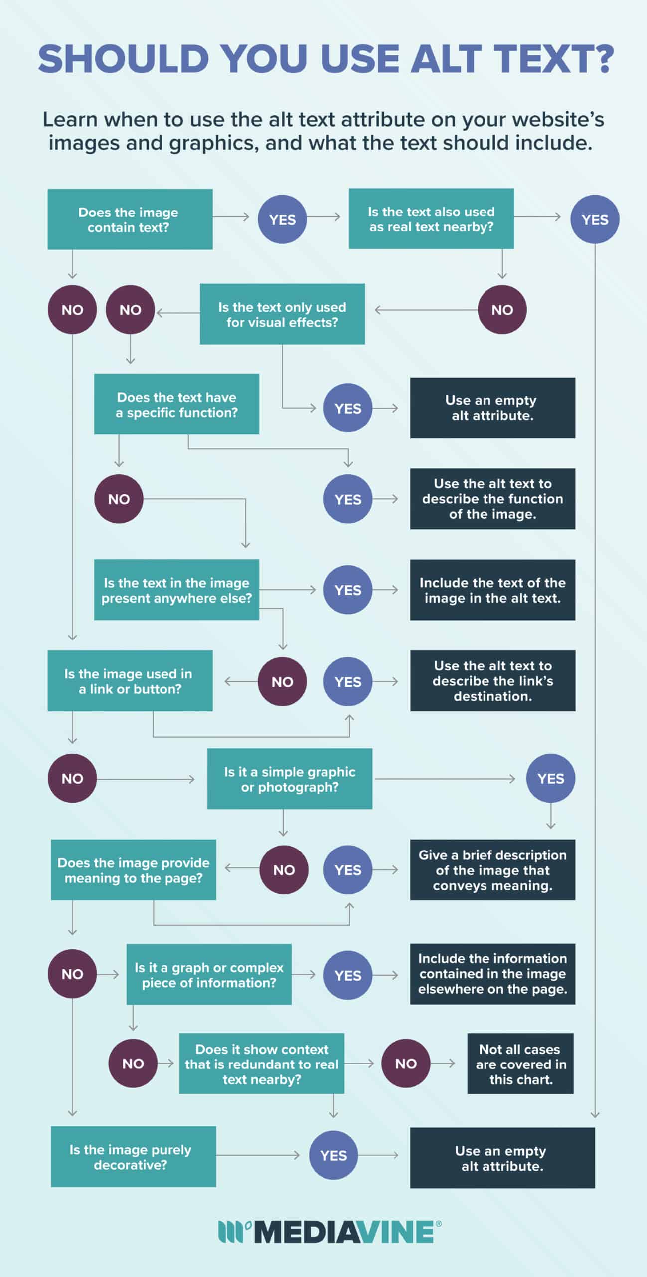
Do you always need alt text?
Glad you asked. You always need the alt attribute, but you may not always need text in it. That’s according to the W3C (World Wide Web Consortium) and their Web Content Accessibility Guidelines (WGAC). Google’s advice is rooted in making the web more accessible, so by that standard, using WCAG guidelines as a benchmark should also give you a lot of confidence on the SEO front. When it comes to alt text on an image, and when you actually need it, the W3C has a great alt text decision tree which we riffed on, teal-ified and included above. Short answer: If your image is relevant to the post or content you are writing about, then yes. Chances are any images you’re using in your blog post are going to be relevant, and all should get descriptive alt text. However, in your theme and perhaps other third party plugins and JavaScript, not all images require alt text. Instead, you can serve a blank or null alt text. You still have an alt attribute, but its value is blank. e.g.: <img alt=””>When do you use blank alt text?
If you have a purely decorative image, you don’t need to describe it to readers. For instance, the W3 mentions cases like a decorative line or other aesthetic elements of your theme. If the image in question is not important to the content itself, and is a purely visual element that doesn’t add value to the reading experience, set a blank alt attribute. Again, put yourself in the impaired reader’s position. Your website may be beautifully designed, but by definition, readers who can’t see it don’t need to know about the aesthetics. Describing things such as a “horizontal line” or a really cool “background” won’t help that reader understand your website or its content; if anything it may disrupt their experience. My advice is to actually try out a screen reader yourself when using your own site. There are free options, including ones typically built into your operating system, so try it. Did adding that alt text improve or actually hurt your user experience? Probably the latter if you’re having a screen reader describe a bunch of purely design-oriented images. These are known as decorative images in W3C speak, and you don’t want to describe them. Want another common example of unnecessary alternative text? On things like a recipe index, homepage or related posts widgets, we often see publishers include an image along with text in their links. If the photo is just a visual guide, and the text in the link itself already describes what you’re linking to, use blank alt text! Again, use the screen reader test. You would just be reading the same text twice. This is what the W3C describes as (redundant) functional images. Blank them up!What about Pinterest descriptions?
Yes, there was a time when Pinterest had content creators everywhere accidentally using their alt text for Pinterest optimizations. We saw plenty of bloggers stuffing their alt text with hashtags, and other terrible abuses. This was a very dark period in our lives. We recommend using a social sharing plugin like Grow to set Pinterest image descriptions using the data-pin-description attributes, as opposed to misappropriating the alt attribute. Your visually impaired readers and Google will thank you.
Do I need to fix all of my alt text?
Not obsessively, but if you have old posts with issues that may apply, you should fix them the next time you go to edit your posts. (We talked a lot about this during ‘The ADA, Web Accessibility and Your Site’ Facebook Live, which is still available for viewing.) If you’re following our Improving Your RPM Go for Teal series, then hopefully you’re already revisiting your top posts regularly. The next time you do this, clean up your alt text.Alternate text checks all the boxes
You may have noticed a theme in our SEO series if you’re a Mediavine regular. If not, we’ll spell it out for you directly: Whether it’s with advertising, SEO or accessibility, we take our cues from Google (and in this case the W3C as well) in improving the web experience for our publishers and their readers alike. A small thing like alt text is just one of many examples. What makes an optimized, better positioned and sustainable website — and makes you more money — also makes happier audiences.About the author
Share this page